How to Choose the Right Color Palette for Your Website
I once spent three hours picking the "perfect" shade of blue for a landing page. Three hours. I compared hex codes side by side, asked friends for opinions, and second-guessed myself every five minutes. The result? It looked fine. Just fine. Not amazing, not terrible — fine.
That's the trap with color selection. It feels subjective, so you either overthink it or just grab something and hope for the best. But here's the thing: there's actually a method to it. Not a rigid formula, but a repeatable process that gets you to a good palette faster than guessing ever will.
Start With One Color, Not Five
Most people try to pick an entire palette at once. That's like trying to write a song by composing all the instruments simultaneously. It doesn't work.
Instead, start with your primary color — the one that represents your brand. Everything else flows from there. If you already have a logo or brand identity, your primary color is probably locked in. If not, think about what feeling you want to evoke:
- Trust and stability — Blues (that's why banks and healthcare love them)
- Energy and urgency — Reds and oranges
- Growth and freshness — Greens
- Creativity and luxury — Purples and deep indigos
- Minimalism and sophistication — Black, white, and grays with one accent
Once you have your primary, everything else is just math and a few rules.
The 60-30-10 Rule (And Why It Actually Works)
Interior designers have used this ratio for decades, and it translates perfectly to web design. Here's how it breaks down:
- 60% — Dominant color: Your background, large surface areas. Usually a neutral or very muted version of your primary.
- 30% — Secondary color: Navigation, cards, sidebars. This supports the dominant color without competing with it.
- 10% — Accent color: CTAs, highlights, important links. This is where your most vibrant color lives.
Why does this work? Because it creates visual hierarchy automatically. When 60% of your page is one color, the eye knows where to settle. The 30% provides structure. And the 10% draws attention exactly where you want it — usually the "Buy Now" or "Sign Up" button.
I've seen too many sites where the accent color is splashed everywhere. Headers, buttons, backgrounds, borders — all screaming for attention. When everything is loud, nothing is loud. The 60-30-10 rule fixes that.
Generating Your Palette From One Color
Once you have your primary, you need the rest of the palette. Here are the three approaches I use most often:
Monochromatic: Vary the lightness and saturation of your primary color. Take #2563EB (a medium blue) and create lighter and darker versions. This is the safest approach and nearly impossible to mess up. The downside? It can feel flat if you don't introduce enough contrast between shades.
Analogous: Pick colors adjacent to your primary on the color wheel. Blue with blue-green and blue-violet, for example. This creates harmony without being as monotonous as a single-hue palette. Nature uses analogous colors constantly — think of a sunset gradient.
Complementary: Use your primary plus the color directly opposite on the wheel. Blue and orange, red and green, purple and yellow. This gives you maximum contrast and energy, but it's the easiest to mess up. Use the complement sparingly — as your 10% accent — or it'll look like a sports jersey.
There are also split-complementary, triadic, and tetradic schemes, but honestly, those are overkill for most websites. If you can't make a 3-color palette look good, adding more colors won't help.
The Neutral Problem
Here's something most color palette guides skip: your neutrals matter more than your colors. Think about it — 60% of your page is neutral. The text you're reading right now is on a neutral background. Neutrals do the heavy lifting.
A common mistake is using pure black (#000000) for text on pure white (#FFFFFF). That contrast is actually too harsh for extended reading. Try #1A1A1A or #2D2D2D instead. Your eyes will thank you, and the page will look more refined.
For backgrounds, pure white can feel clinical. A very slight warmth — like #FAFAF8 or #F8F9FA — makes a surprising difference in how "premium" a site feels. I learned this from studying Stripe's design system. They don't use pure white anywhere.
And in dark mode, don't just invert. Pure black backgrounds with white text are the dark-mode equivalent of the harsh contrast problem. Use #121212 or #1A1A2E instead — Google's Material Design team has research showing these are easier on the eyes.
Accessibility Is Not Optional
Roughly 1 in 12 men and 1 in 200 women have some form of color vision deficiency. If your palette doesn't account for this, you're excluding millions of users — and potentially violating accessibility laws depending on your region.
The WCAG guidelines specify minimum contrast ratios:
- Normal text: 4.5:1 contrast ratio against the background
- Large text (18px+ bold or 24px+ regular): 3:1 ratio
- UI components and graphical objects: 3:1 ratio
There's no substitute for actually testing your colors. I can't tell you how many times I've picked a palette that looked great to me, then ran it through a contrast checker and discovered my secondary text was invisible to anyone with deuteranopia.
The most common accessibility failure I see? Light gray text on white backgrounds. Designers love it because it looks clean. But if your text has a contrast ratio below 4.5:1, it's literally unreadable for a significant portion of your audience.
Color and Conversion: What the Data Actually Says
You've probably heard that "red buttons convert better" or "blue builds trust." Let me save you some time: the research is way more nuanced than that.
The famous "red vs green button" A/B test by HubSpot showed red outperforming green by 21%. But the test was on a predominantly green page. The red button won because it had more contrast, not because red is inherently more "clickable."
What actually drives conversion is contrast against the surrounding elements. Your CTA button needs to be the most visually distinct element on the page. If your page is mostly blue, a orange or yellow button will outperform another shade of blue — not because of color psychology, but because it stands out.
The lesson: don't chase "high-converting colors." Chase contrast and visual hierarchy.
Tools I Actually Use
Here's my actual workflow for building a color palette from scratch:
- Pick a primary color based on brand identity or the feeling I'm going for.
- Generate the palette using a color palette generator that gives me complementary, analogous, and monochromatic options automatically.
- Build out shades — I need at least 5-7 shades of my primary color for different UI states (hover, active, disabled, etc.).
- Test contrast ratios for every text/background combination.
- Preview in context — colors look different in a palette than they do on an actual page with real content.
That last step is crucial. A palette that looks gorgeous in isolation can fall apart when you put it next to real content. Photos, illustrations, and user-generated content all introduce colors that interact with your palette in ways you can't predict from swatches alone.
Common Mistakes I See Constantly
Too many colors: If your palette has more than 5 distinct hues, you probably need to cut. Most beautiful websites use 2-3 colors plus neutrals.
Ignoring color temperature: Mixing warm and cool tones without intention creates visual tension. Sometimes that's the point, but usually it's an accident. Pick a temperature and stick with it, or use temperature contrast deliberately.
Forgetting about dark mode: Colors that look great on white can look garish or washed out on dark backgrounds. Test both modes from the start, not as an afterthought.
Copying without understanding: I'm all for taking inspiration from well-designed sites. But copying a hex code without understanding why it works in its original context is like wearing someone else's prescription glasses. The color worked because of its relationships to surrounding colors, not in isolation.
The Bottom Line
Color selection doesn't have to be a creative crisis. Start with one primary color, use the 60-30-10 rule for distribution, pick a generation strategy (monochromatic, analogous, or complementary), and validate for accessibility. That's it. The process takes 20 minutes if you're not overthinking it.
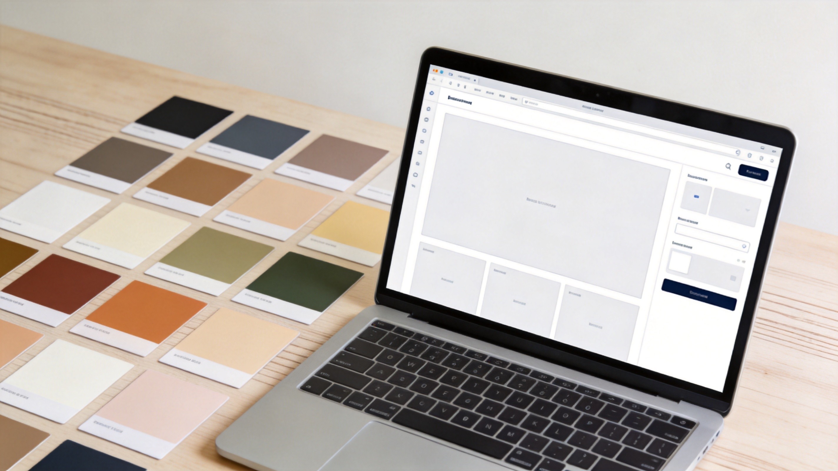
If you want to skip the manual work, I built a color palette generator that handles all of this — it generates complementary, analogous, and monochromatic palettes from any starting color, shows contrast ratios, and exports CSS variables ready to paste into your project. Give it your primary color and it does the rest.